因为今天8月28日就是中国的情人节—七夕,作为程序猿一枚的我就只有在家敲代码咯!但我还是有一颗脱单的心;制作了h5+css+js界面祝小伙伴们:七夕快乐
具体的功能有:
1.下雪的背景动画
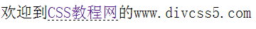
2.下面的文字逐字显示,并伴有语音
3.中部的图片3d轮播

附上源码:
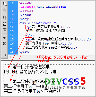
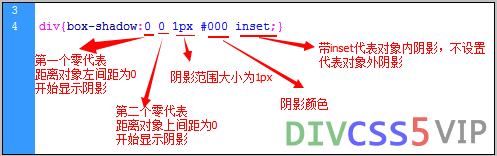
!doctype html html head meta charset= UTF-8 meta name= Keywords content= 关键字,关键词 meta name= Description content= 描述信息 title 七夕快乐 /title !--css 样式 层叠样式表-- style type= text/css *{margin:0;padding:0;} html,body{width:100%;height:100%;} body{background:url(images/3.jpg);background-size:cover;overflow:hidden;} /*top start*/ .top{width:400px;height:100px;margin:60px auto;font-size:30px;font-family: 华文行楷 color:#fff;} /*background:-webkit-linear-gradient(45deg,#ff0000,#ff0099,#ffff00,#33ff00,#3300cc,#000000);*/ /*end top*/ /*box start*/ .box{width:310px;height:310px;margin:auto;perspective:800px;} .box .pic{position:relative;transform-style:preserve-3d;/*搭载3d环境*/animation:play 10s linear infinite;} /*animation:play 速度 匀速 循环;*/ .box ul li{list-style:none;position:absolute;top:0;left:0;} /*end box*/ #text{width:500px;height:200px;margin:auto;color:#6fade1;margin:auto;font-size:24px;font-family: 方正喵呜体 } /*定义一个关键帧*/ @keyframes play{ from{transform:rotateY(0deg);} to{transform:rotateY(360deg);} /style /head body !--top start-- p >以上就是html5+CSS3+JS七夕告白功能实现详解的详细内容,html教程
郑重声明:本文版权归原作者所有,转载文章仅为传播更多信息之目的,如作者信息标记有误,请第一时间联系我们修改或删除,多谢。
新闻热点


疑难解答