本文实例为大家分享了微信小程序自定义轮播图展示的具体代码,供大家参考,具体内容如下
默认的swiper面板指示点都是小圆点黑灰的,但这满足不了广大小伙伴需求,比如其他颜色的,椭圆形的,方形的等等。
首先当然是要禁用掉(直接删掉)swiper属性indicator-dots,再用view组件模拟dots,对应的代码如下:
<view class="swiper-container"> <swiper autoplay="auto" interval="5000" duration="500" current="{{swiperCurrent}}" bindchange="swiperChange" class="swiper"> <block wx:for="{{slider}}" wx:key="unique"> <swiper-item> <image src="{{item.picUrl}}" class="img"></image> </swiper-item> </block> </swiper> <view class="dots"> <block wx:for="{{slider}}" wx:key="unique"> <view class="dot{{index == swiperCurrent ? ' active' : ''}}"></view> </block> </view></view> 然后是wxss代码:
swiper-container{ position: relative;}.swiper-container .swiper{ height: 300rpx;}.swiper-container .swiper .img{ width: 100%; height: 100%;}.swiper-container .dots{ position: absolute; left: 0; right: 0; bottom: 20rpx; display: flex; justify-content: center;}.swiper-container .dots .dot{ margin: 0 8rpx; width: 14rpx; height: 14rpx; background: #fff; border-radius: 8rpx; transition: all .6s;}.swiper-container .dots .dot.active{ width: 24rpx; background: #f80;} 再对swiper的bindchange属性绑定对应的事件:
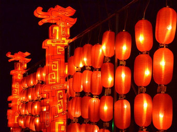
Page({data: { slider: [ {picUrl: '../../images/T003R720x288M000000rVobR3xG73f.jpg'}, {picUrl: '../../images/T003R720x288M000000j6Tax0WLWhD.jpg'}, {picUrl: '../../images/T003R720x288M000000a4LLK2VXxvj.jpg'}, ], swiperCurrent: 0,},swiperChange: function(e){ this.setData({ swiperCurrent: e.detail.current })}}) 效果图:

以上就是本文的全部内容,希望对大家的学习有所帮助,也希望大家多多支持VEVB武林网。