首页| 新闻| 娱乐| 游戏| 科普| 文学| 编程| 系统| 数据库| 建站| 学院| 产品| 网管| 维修| 办公| 热点
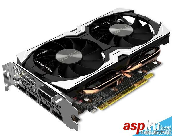
索泰发布一款GTX 1070 Mini迷
AMD新旗舰显卡轻松干翻NVIDIA
索泰发布一款GTX 1070 Mini迷你版本:小机
芭蕾舞蹈表演,真实美到极致
下午茶时间,悠然自得的休憩
充斥这繁华奢靡气息的城市迪拜风景图片
从山间到田野再到大海美丽的自然风景图片
肉食主义者的最爱美食烤肉图片
夏日甜心草莓美食图片
人逢知己千杯少,喝酒搞笑图集
搞笑试卷,学生恶搞答题
新闻热点
疑难解答
图片精选
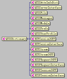
Dictionary数据类型在Darwin视频服
可穿戴手势识别控制器
网友关注