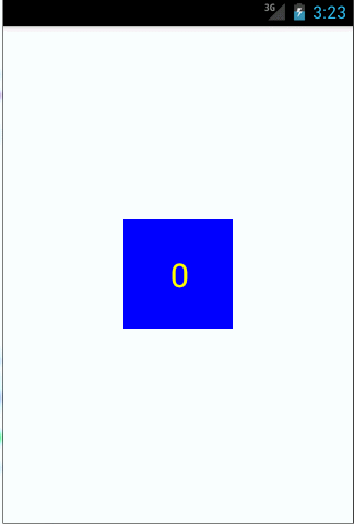
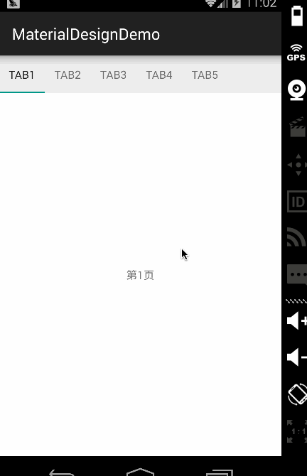
今天在项目中写了一个自定义的控件,是一个页面的title,基本每个页面都要用到。没有使用actionbar或者toolbar,看看以后是否能够改用toolbar来实现。这是效果图: 
首先我写了title的布局文件,放了三个控件,左边,中间,和右边:
<?xml version="1.0" encoding="utf-8"?><RelativeLayout xmlns:android="http://schemas.android.com/apk/res/android" android:layout_width="match_parent" android:layout_height="@dimen/xhdpi_50" android:background="@color/background_yellow" android:clipToPadding="true" android:fitsSystemWindows="true" android:gravity="center_vertical"> <TextView android:id="@+id/title_text" android:layout_width="wrap_content" android:layout_height="wrap_content" android:layout_centerInParent="true" android:textColor="@color/white" android:textSize="@dimen/xhdpi_16" android:background="@color/background_yellow"/> <TextView android:id="@+id/title_right" android:layout_width="wrap_content" android:layout_height="@dimen/xhdpi_30" android:layout_alignParentRight="true" android:layout_centerVertical="true" android:layout_marginRight="@dimen/xhdpi_5" android:gravity="center" android:paddingLeft="@dimen/xhdpi_2" android:paddingRight="@dimen/xhdpi_2" android:textColor="@color/white" android:textSize="@dimen/xhdpi_16" android:background="@color/background_yellow"/> <ImageView android:id="@+id/title_left" android:layout_width="@dimen/xhdpi_40" android:layout_height="@dimen/xhdpi_25" android:layout_marginLeft="@dimen/xhdpi_5" android:layout_alignParentLeft="true" android:layout_centerVertical="true" android:scaleType="fitCenter" android:src="@mipmap/back" android:background="@color/background_yellow"/></RelativeLayout>定义控件的属性:在values文件夹下的atts.xml里面声明属性
<?xml version="1.0" encoding="utf-8"?><resources> <declare-styleable name="Topbar"> <attr name="titleText" format="string"/> <attr name="rightText" format="string"/> <attr name="rightDrawableLeft" format="reference"/> <attr name="rightDrawablePadding" format="dimension"/> </declare-styleable></resources>然后新建一个类继承RelativeLayout,用来加载布局,获取自定义的属性和设置属性,并对外公布设置三个子控件是否显示的方法,以及左右两个控件的点击事件回调的方法,当然这里只是设置点击事件的回调,具体回调的处理逻辑由使用此控件的Activity去实现:
public class Topbar extends RelativeLayout { //子控件 PRivate ImageView leftImageView; private TextView title; private TextView rightTextView; //子控件属性 private String titleText; private String rightText; private Drawable rightDrawableLeft; private float rightDrawablePadding; private TopbarOnClickListener topbarOnClickListener; //Topbar左边和右边点击事件的回调接口 public interface TopbarOnClickListener { public void rightButtonOnClick(); public void leftButtonOnClick(); } public Topbar(Context context, AttributeSet attrs) { super(context, attrs); LayoutInflater.from(context).inflate(R.layout.title, this); rightTextView = (TextView) findViewById(R.id.title_right); title = (TextView) findViewById(R.id.title_text); leftImageView = (ImageView) findViewById(R.id.title_left); //拿到自定义的属性值 TypedArray typedArray = context.obtainStyledAttributes(attrs, R.styleable.Topbar); titleText = typedArray.getString(R.styleable.Topbar_titleText); rightText = typedArray.getString(R.styleable.Topbar_rightText); rightDrawableLeft =typedArray.getDrawable(R.styleable.Topbar_rightDrawableLeft); rightDrawablePadding = typedArray.getDimension(R.styleable.Topbar_rightDrawablePadding,0); //回收typeArray typedArray.recycle(); //设置子控件的属性 title.setText(titleText); rightTextView.setText(rightText); rightTextView.setCompoundDrawablesWithIntrinsicBounds(rightDrawableLeft, null, null, null); rightTextView.setCompoundDrawablePadding((int) rightDrawablePadding); //按下时改变背景颜色 rightTextView.setOnTouchListener(new OnTouchListener() { @Override public boolean onTouch(View v, MotionEvent event) { switch (event.getAction()) { case KeyEvent.ACTION_DOWN: rightTextView.setBackgroundColor(getResources().getColor(R.color.light_gray)); break; case KeyEvent.ACTION_UP: rightTextView.setBackgroundColor(getResources().getColor(R.color.background_yellow)); break; } return false; } }); leftImageView.setOnTouchListener(new OnTouchListener() { @Override public boolean onTouch(View v, MotionEvent event) { switch (event.getAction()) { case KeyEvent.ACTION_DOWN: leftImageView.setBackgroundColor(getResources().getColor(R.color.gray)); break; case KeyEvent.ACTION_UP: leftImageView.setBackgroundColor(getResources().getColor(R.color.background_yellow)); break; } return false; } }); //监听左边和右边点击事件,并调用接口方法 leftImageView.setOnClickListener(new OnClickListener() { @Override public void onClick(View v) { topbarOnClickListener.leftButtonOnClick(); } }); rightTextView.setOnClickListener(new OnClickListener() { @Override public void onClick(View v) { topbarOnClickListener.rightButtonOnClick(); } }); } //设置Topbar点击事件的监听 public void setTopbarOnClickListener(TopbarOnClickListener topbarOnClickListener) { this.topbarOnClickListener = topbarOnClickListener; } //设置右边是否显示 public void setRightVisibility(boolean flag) { if (flag) { rightTextView.setVisibility(View.VISIBLE); } else { rightTextView.setVisibility(View.GONE); } } //设置左边是否显示 public void setLeftVisibility(boolean flag) { if (flag) { leftImageView.setVisibility(View.VISIBLE); } else { leftImageView.setVisibility(View.GONE); } } //设置中间是否显示 public void setTitleVisibility(boolean flag) { if (flag) { title.setVisibility(View.VISIBLE); } else { title.setVisibility(View.GONE); } }}大功告成,在布局文件中就可以使用此控件了,注意定义此控件自定义的属性时,需要在布局文件中声明命名空间:
xmlns:custom="http://schemas.android.com/apk/res-auto"新闻热点


疑难解答