这篇文章主要介绍了Android编程实现自定义进度条颜色的方法,涉及Android进度条的样式布局及功能实现技巧,具有一定参考借鉴价值,需要的朋友可以参考下
本文实例讲述了Android编程实现自定义进度条颜色的方法。分享给大家供大家参考,具体如下:
android 自定义进度条颜色
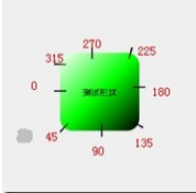
先看图

基于产品经理各种自定义需求,经过查阅了解,下面是自己对android自定义进度条的学习过程!
这个没法了只能看源码了,还好下载了源码, sources/base/core/res/res/ 下应有尽有,修改进度条颜色只能找progress ,因为是改变样式,首先找styles.xml
找到xml后,进去找到
- <style name="Widget.ProgressBar">
- <item name="android:indeterminateOnly">true</item>
- <item name="android:indeterminateDrawable">@android:drawable/progress_medium_white</item>
- <item name="android:indeterminateBehavior">repeat</item>
- <item name="android:indeterminateDuration">3500</item>
- <item name="android:minWidth">48dip</item>
- <item name="android:maxWidth">48dip</item>
- <item name="android:minHeight">48dip</item>
- <item name="android:maxHeight">48dip</item>
- </style>
这是默认转圈的效果style,但今天我们修改的是水平进度条颜色!
所以找到
- <style name="Widget.ProgressBar.Horizontal">
- <item name="android:indeterminateOnly">false</item>
- <item name="android:progressDrawable">@android:drawable/progress_horizontal</item>
- <item name="android:indeterminateDrawable">@android:drawable/progress_indeterminate_horizontal</item>
- <item name="android:minHeight">20dip</item>
- <item name="android:maxHeight">20dip</item>
- </style>
你看系统一步一步关联的,扩展性很性,低耦合,所以我们现在只要改变进度条是怎么样画出来的就行了 ,但是负责画进度条的是
- <?xml version="1.0" encoding="utf-8"?>
- <!-- Copyright (C) 2008 The Android Open Source Project
- Licensed under the Apache License, Version 2.0 (the "License");
- you may not use this file except in compliance with the License.
- You may obtain a copy of the License at
- http://www.apache.org/licenses/LICENSE-2.0
- Unless required by applicable law or agreed to in writing, software
- distributed under the License is distributed on an "AS IS" BASIS,
- WITHOUT WARRANTIES OR CONDITIONS OF ANY KIND, either express or implied.
- See the License for the specific language governing permissions and
- limitations under the License.
- -->
- <layer-list xmlns:android="http://schemas.android.com/apk/res/android">
- <item android:id="@android:id/background">
- <shape>
- <corners android:radius="5dip" />
- <gradient
- android:startColor="#ff9d9e9d"
- android:centerColor="#ff5a5d5a"
- android:centerY="0.75"
- android:endColor="#ff747674"
- android:angle="270"
- />
- </shape>
- </item>
- <item android:id="@android:id/secondaryProgress">
- <clip>
- <shape>
- <corners android:radius="5dip" />
- <gradient
- android:startColor="#80ffd300"
- android:centerColor="#80ffb600"
- android:centerY="0.75"
- android:endColor="#a0ffcb00"
- android:angle="270"
- />
- </shape>
- </clip>
- </item>
- <item android:id="@android:id/progress">
- <clip>
- <shape>
- <corners android:radius="5dip" />
- <gradient
- android:startColor="#ffffd300"
- android:centerColor="#ffffb600"
- android:centerY="0.75"
- android:endColor="#ffffcb00"
- android:angle="270"
- />
- </shape>
- </clip>
- </item>
- </layer-list>
看到没有,这是系统的进度条画出的布局条件
- android:startColor="#80ffd300"
- android:centerColor="#80ffb600"
- android:endColor="#ff747674"
我们只要改变这个色值就能改变他的颜色,主要改变的是
说了这么多,到底怎么做呢, 很简单
1. 在我们的项目下新建一个 style.xml 文件
创建一个style 标签,集成系统默认样式,然后自定义一个新的progressDrawable 文件,随后面在layout 中的progress 中引用这个文件就行
- <style name="ProgressBar_Mini" parent="@android:style/Widget.ProgressBar.Horizontal">
- <item name="android:maxHeight">50dip</item>
- <item name="android:minHeight">8dip</item>
- <item name="android:indeterminateOnly">false</item>
- <item name="android:indeterminateDrawable">@android:drawable/progress_indeterminate_horizontal</item>
- <item name="android:progressDrawable">@drawable/progressbar_mini</item>
- </style>
下面是我的 progressbar_mini 文件,改变了下android:endColor="#F5F5F5" android:startColor="#BEBEBE" 的色值
- <layer-list xmlns:android="http://schemas.android.com/apk/res/android" >
- <item android:id="@android:id/background">
- <shape >
- <corners android:radius="5dip" />
- <gradient
- android:angle="270"
- android:centerY="0.75"
- android:endColor="#F5F5F5"
- android:startColor="#BEBEBE" />
- </shape>
- </item>
- <item android:id="@android:id/secondaryProgress">
- <clip >
- <shape >
- <corners android:radius="0dip" />
- <gradient
- android:angle="270"
- android:centerY="0.75"
- android:endColor="#165CBC"
- android:startColor="#85B0E9" />
- </shape>
- </clip>
- </item>
- <item android:id="@android:id/progress">
- <clip >
- <shape >
- <corners android:radius="5dip" />
- <gradient
- android:angle="270"
- android:centerY="0.75"
- android:endColor="#165CBC"
- android:startColor="#85B0E9" />
- </shape>
- </clip>
- </item>
- </layer-list>
最后在中引用就可以了
- <ProgressBar
- android:id="@+id/progress"
- style="@style/ProgressBar_Mini"
- android:layout_width="fill_parent"
- android:layout_height="wrap_content"
- android:progress="50" />

希望本文所述对大家Android程序设计有所帮助。
新闻热点


疑难解答