大家都知道,Matplotlib 是众多 Python 可视化包的鼻祖,也是Python最常用的标准可视化库,其功能非常强大,同时也非常复杂,想要搞明白并非易事。但自从Python进入3.0时代以后,pandas的使用变得更加普及,它的身影经常见于市场分析、爬虫、金融分析以及科学计算中。
作为数据分析工具的集大成者,pandas作者曾说,pandas中的可视化功能比plt更加简便和功能强大。实际上,如果是对图表细节有极高要求,那么建议大家使用matplotlib通过底层图表模块进行编码。当然,我们大部分人在工作中是不会有这样变态的要求的,所以一句import pandas as pd就足够应付全部的可视化工作了。
下面,我们总结一下PD库的一些使用方法和入门技巧。
一、线型图
对于pandas的内置数据类型,Series 和 DataFrame 都有一个用于生成各类 图表 的 plot 方法。 默认情况下, 它们所生成的是线型图。其实Series和DataFrame上的这个功能只是使用matplotlib库的plot()方法的简单包装实现。参考以下示例代码 -
import pandas as pdimport numpy as np df = pd.DataFrame(np.random.randn(10,4),index=pd.date_range('2018/12/18', periods=10), columns=list('ABCD')) df.plot()执行上面示例代码,得到以下结果 -
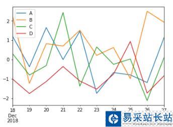
如果索引由日期组成,则调用gct().autofmt_xdate()来格式化x轴,如上图所示。
我们可以使用x和y关键字绘制一列与另一列。
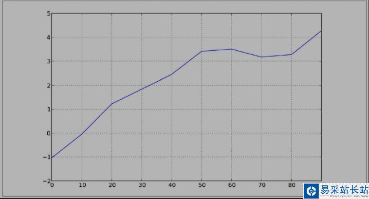
s = Series( np. random. randn( 10). cumsum(), index= np. arange( 0, 100, 10))s. plot()
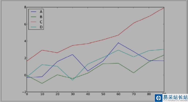
pandas 的大部分绘图方法都有 一个 可选的ax参数, 它可以是一个 matplotlib 的 subplot 对象。 这使你能够在网格 布局 中 更为灵活地处理 subplot 的位置。 DataFrame的plot 方法会在 一个 subplot 中为各列绘制 一条 线, 并自动创建图例( 如图所示):
df = DataFrame( np. random. randn( 10, 4). cumsum( 0), ...: columns=[' A', 'B', 'C', 'D'], index= np. arange( 0, 100, 10)) df. plot()
二、柱状图
在生成线型图的代码中加上 kind=' bar'( 垂直柱状图) 或 kind=' barh'( 水平柱状图) 即可生成柱状图。 这时,Series 和 DataFrame 的索引将会被用 作 X( bar) 或 (barh)刻度:
In [59]: fig, axes = plt. subplots( 2, 1) In [60]: data = Series( np. random. rand( 16), index= list(' abcdefghijklmnop')) In [61]: data. plot( kind=' bar', ax= axes[ 0], color=' k', alpha= 0. 7) Out[ 61]: < matplotlib. axes. AxesSubplot at 0x4ee7750> In [62]: data. plot( kind=' barh', ax= axes[ 1], color=' k', alpha= 0.
新闻热点


疑难解答